_
EN
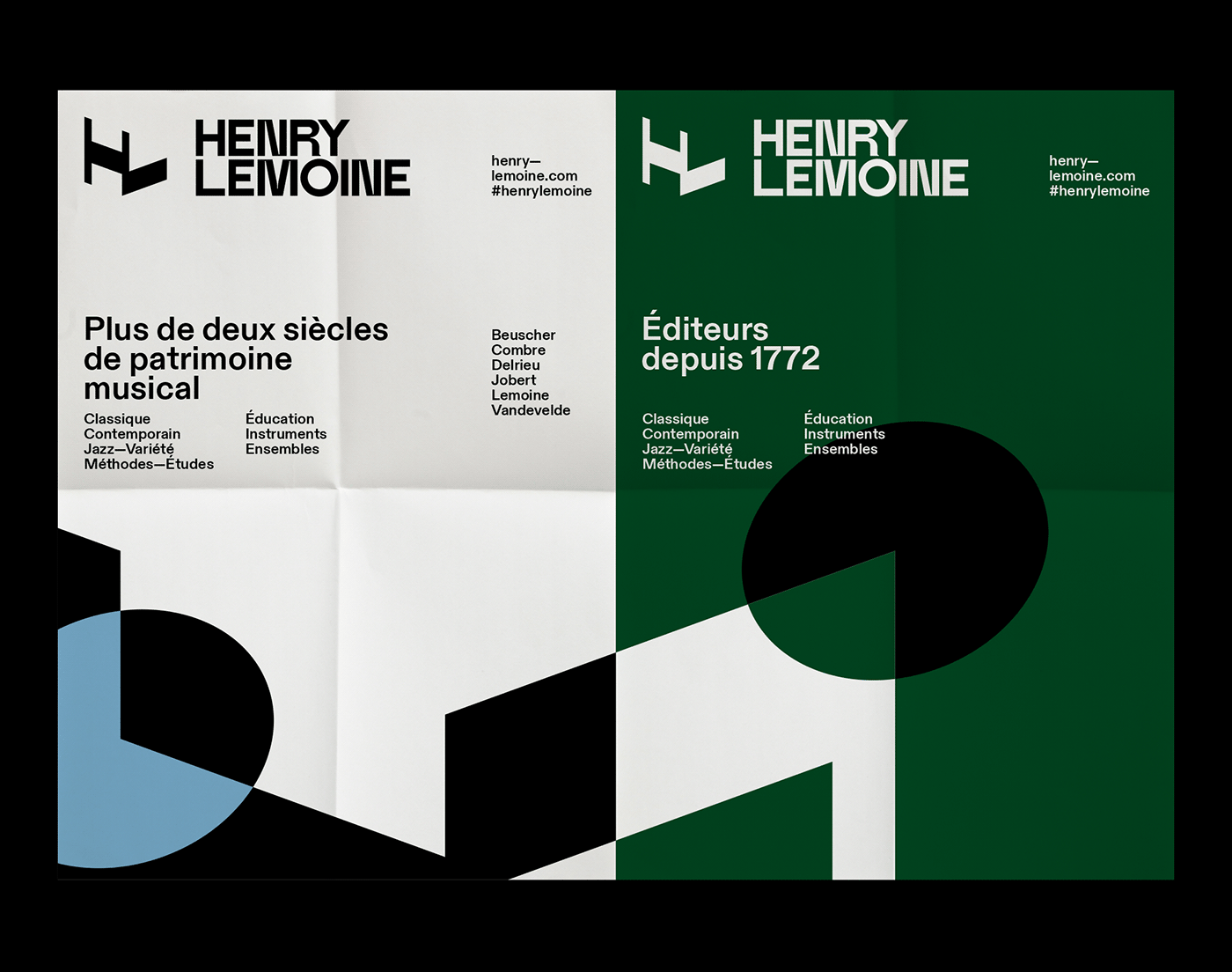
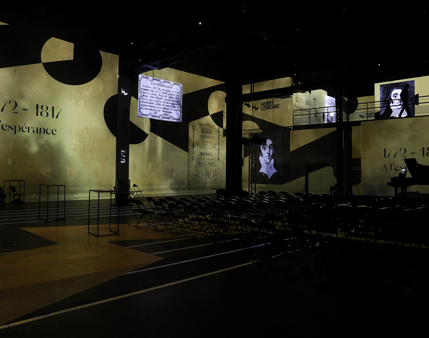
Henry Lemoine is the oldest French publishing house, and the reference in musical scores; it was in 1772 that Antoine-Marcel Lemoine, composer, violinist and music teacher, founded the company at 556, rue de l'Echelle-Honoré in Paris. Still run by the Lemoine family, the company continues to celebrate 250 years of history, which will be celebrated in November 2022 at the Atelier des Lumières in Paris, where the new visual identity created by Brand Brothers was unveiled.
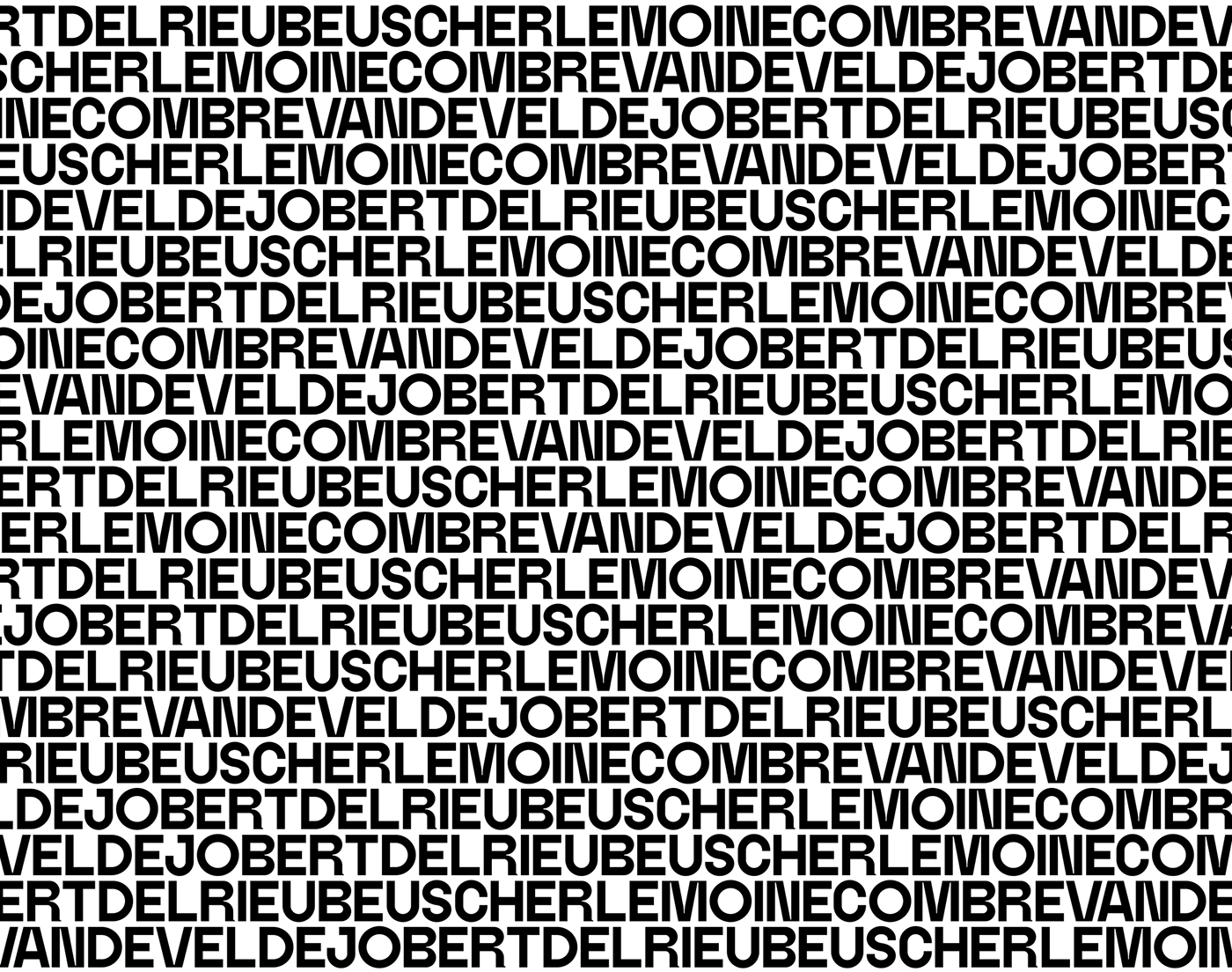
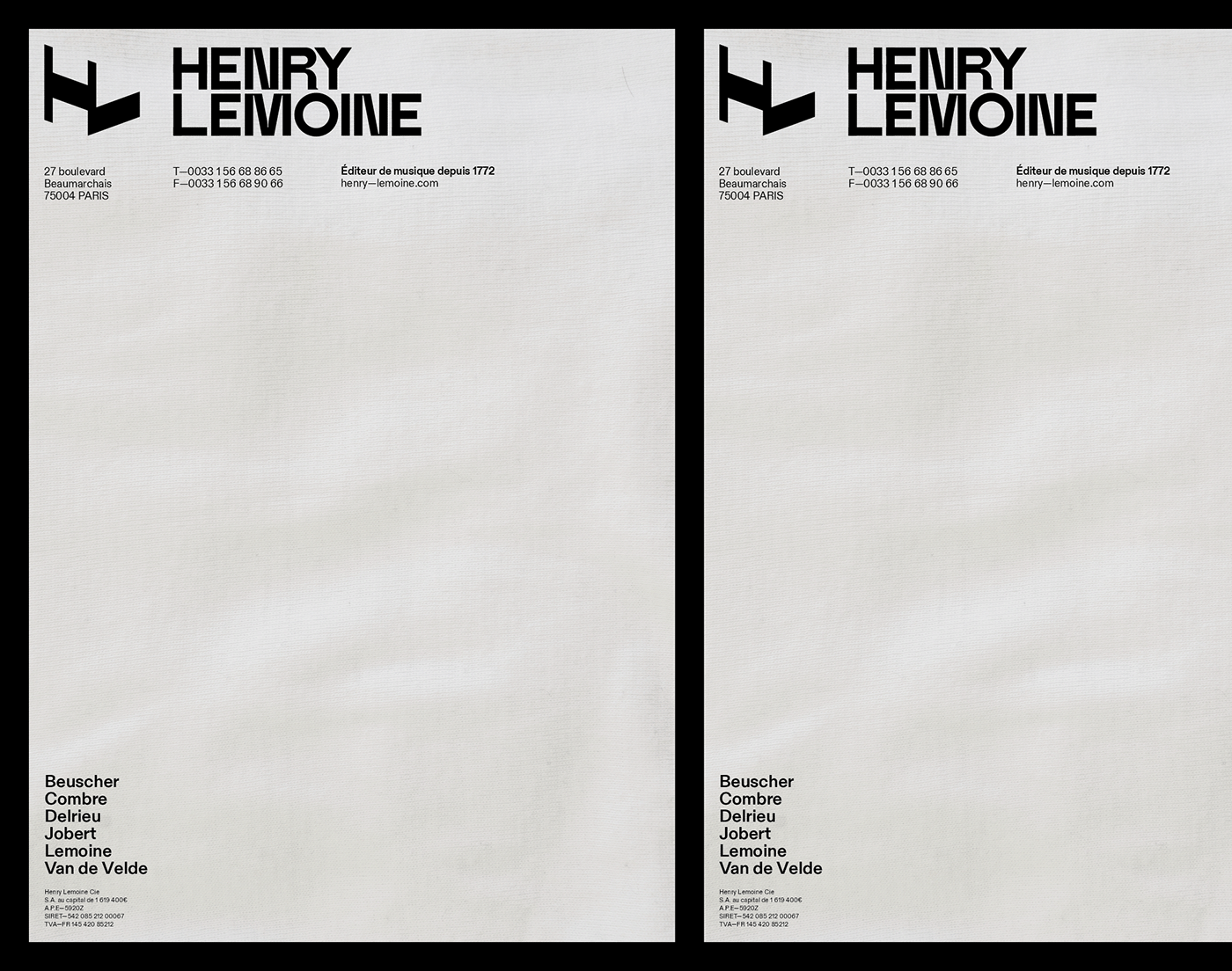
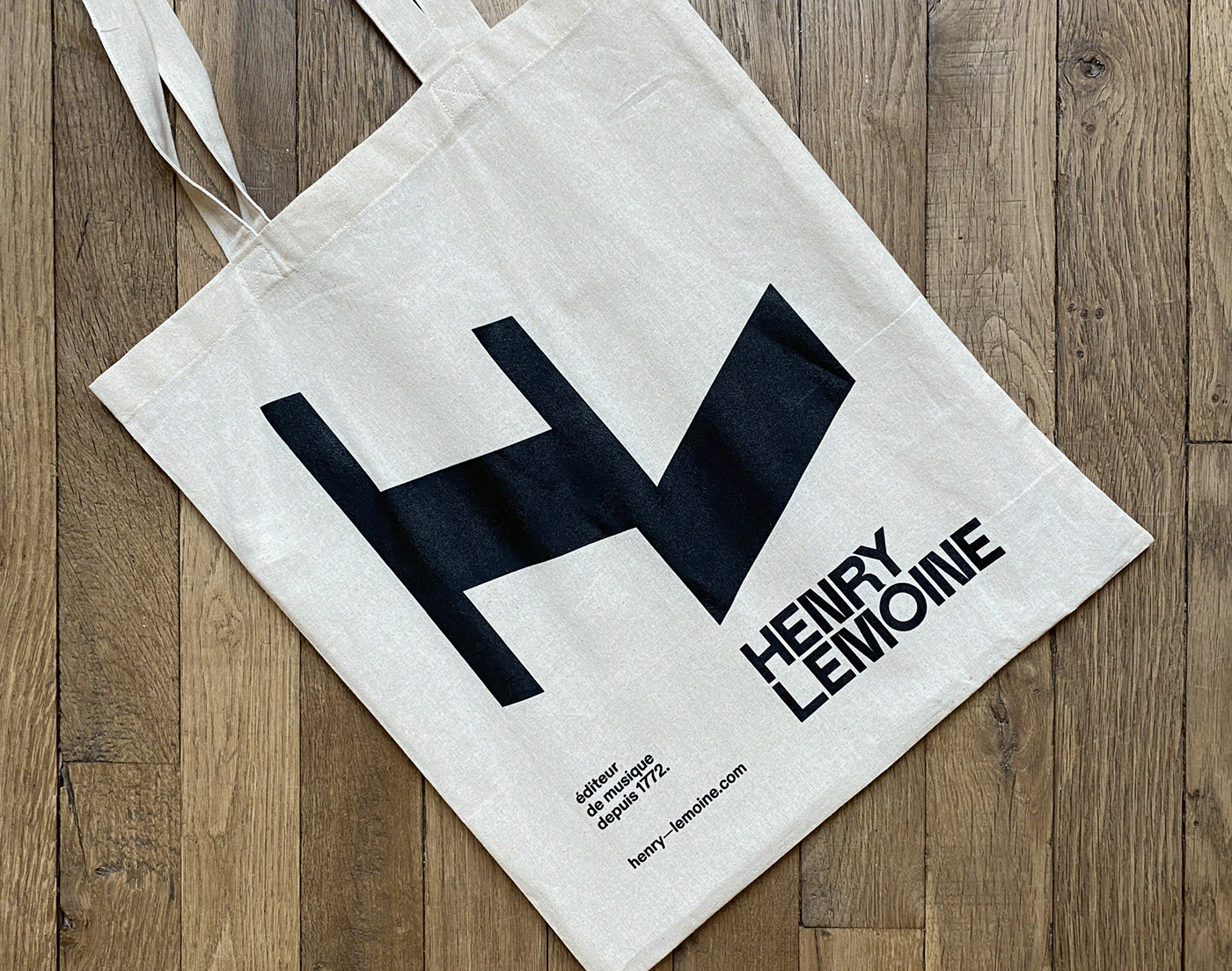
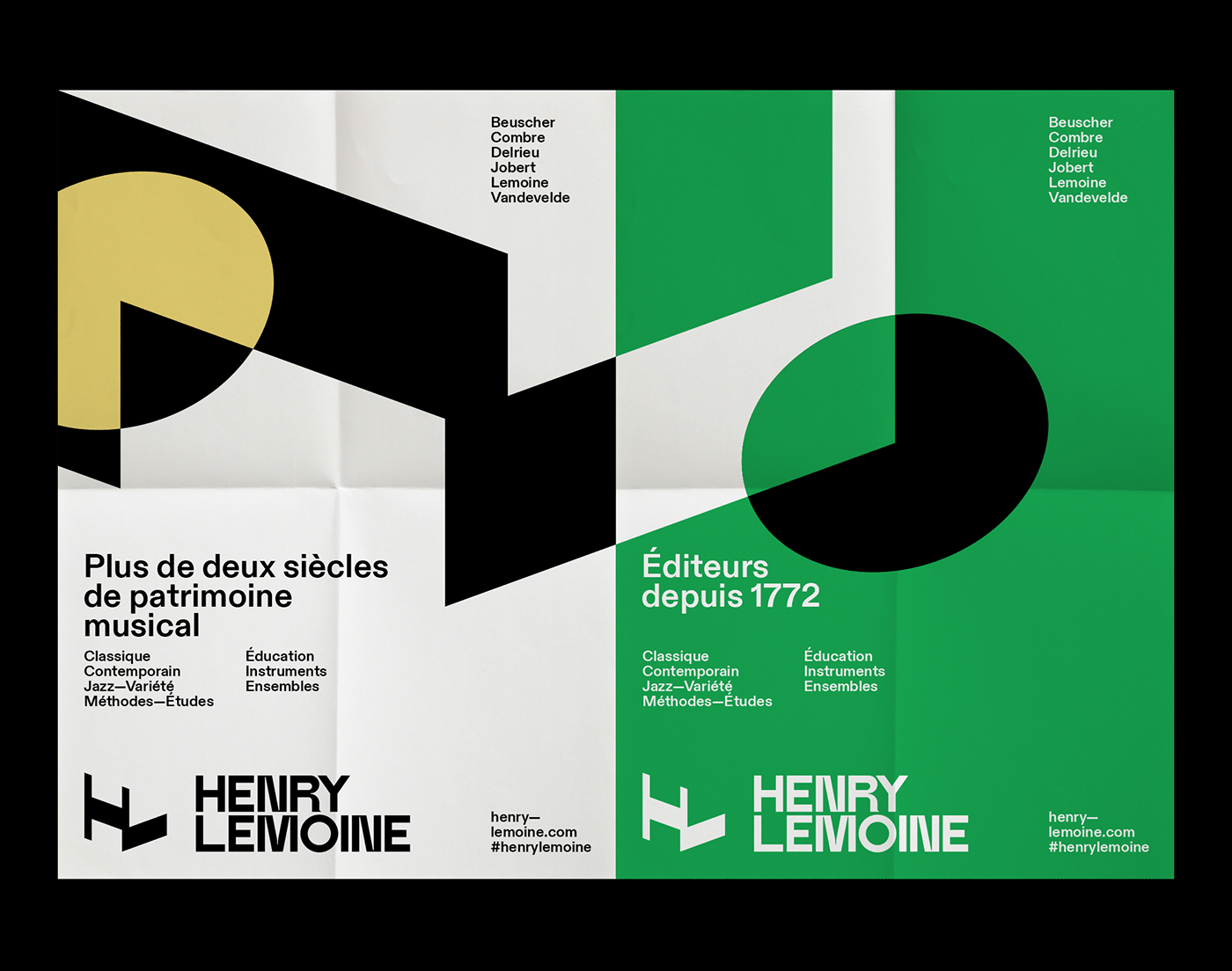
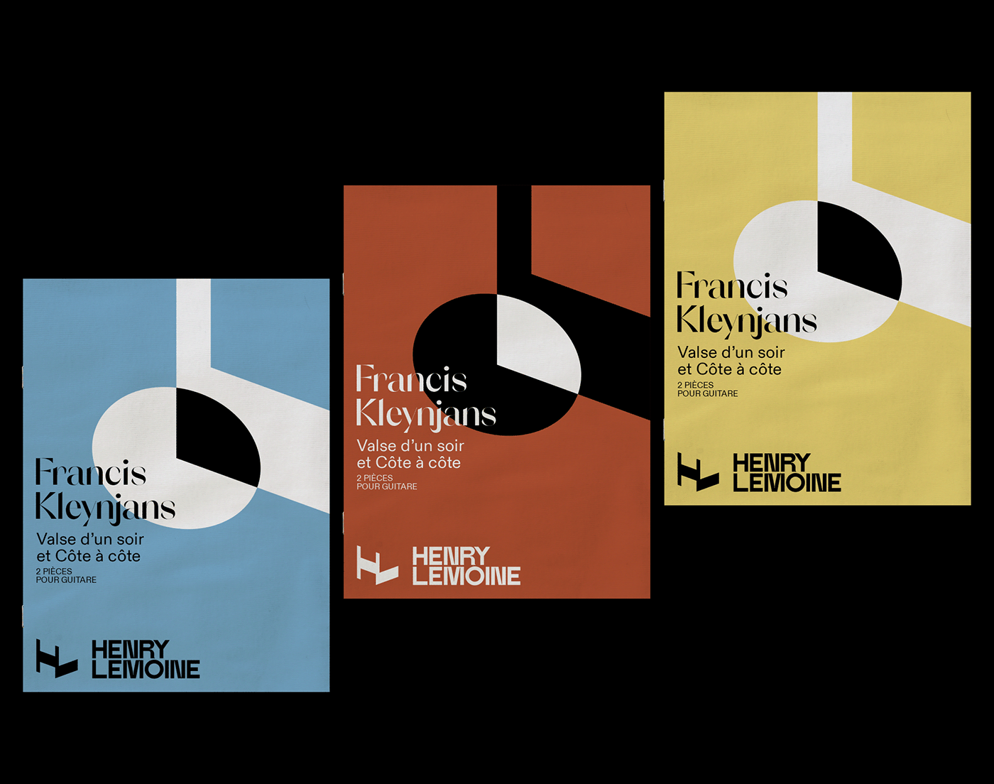
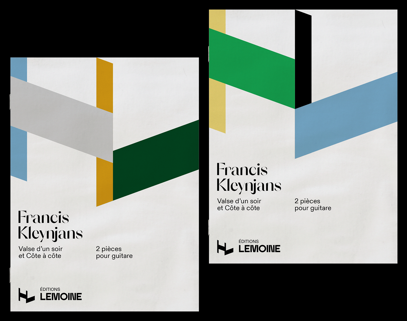
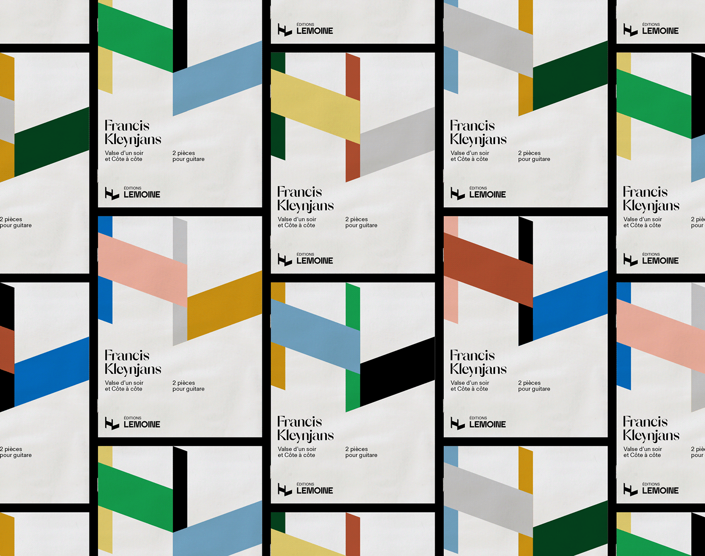
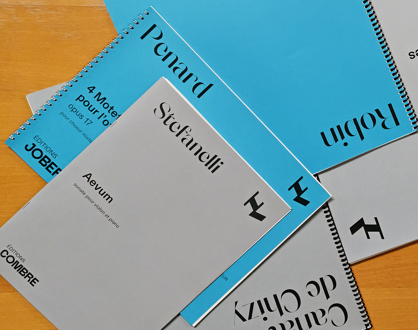
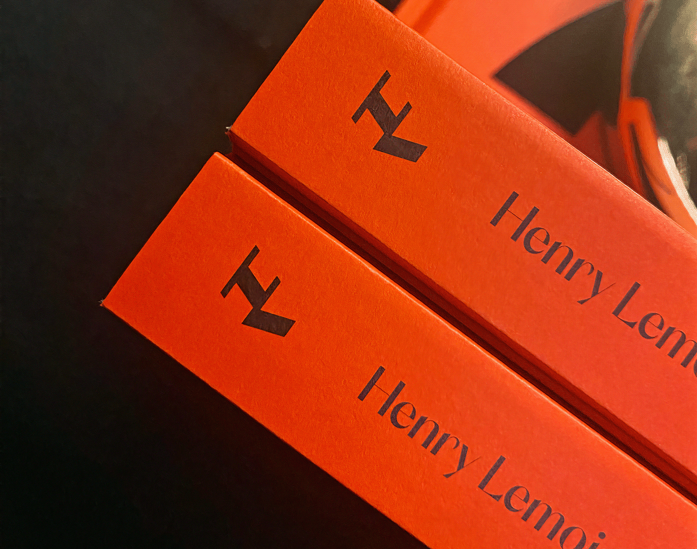
We developed a new typeface for Henry Lemoine and all of its publishing houses. A stable and contemporary lettering, completed by a HL monogram that unites all the names. This monogram uses the structure of the double eighth note and provides Henry Lemoine with a timeless, rhythmic and sophisticated sign. Associated with two accompanying typefaces, Orelo (Pizza Typefaces) and Diatype (Dinamo), the new visual system allows for the complete renewal of the score catalog, allowing for a clear hierarchy and variety that responds to the completeness of the publication offer. On the occasion of the 250th anniversary event, a book tracing the history of the company, based on the graphic charter, was designed by Studio Vicente Granger, and presented alongside the new visual territory.

_
FR
Henry Lemoine est la plus ancienne maison d'édition française, et la référence en ce qui concerne les partitions musicales ; c’est en 1772 qu’Antoine-Marcel Lemoine, compositeur, violoniste et professeur de musique, fonde la maison au 556, rue de l’Echelle-Honoré à Paris. Toujours dirigée par la famille Lemoine, elle perpétue 250 ans d'histoire, fêtés en novembre 2022 à l'Atelier des Lumières à Paris, soirée à l'occasion de laquelle la nouvelle identité visuelle créée par Brand Brothers a été dévoilée.
Nous avons développé un nouveau caractère typographique pour Henry Lemoine et l'ensemble de ses maisons d'éditions. Un lettrage stable et contemporain, complété par un monogramme HL qui vient unir l'ensemble des noms. Ce monogramme reprend la structure de la double croche et procure à Henry Lemoine un signe intemporel, rythmé et sophistiqué. Associé à deux caractères d'accompagnements, Orelo (Pizza Typefaces) et Diatype (Dinamo), le nouveau système visuel permet le renouvellement intégral du catalogue de partitions, en permettant une hiérarchie claire et une variété qui répond à l'exhaustivité de l'offre de publications. A l'occasion de l'événement des 250 ans, un livre retraçant l'histoire de la maison, basé sur la charte graphique, a été designé par le Studio Vicente Granger, et présenté aux côtés du nouveau territoire visuel.